Wednesday, 14 December 2011

Planning: Target audience

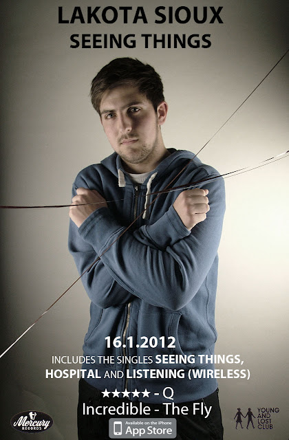
As we know, our video will be able to have the best outcome if we regularly take into consideration views and opinions from our target audience. We set  up a focus group on Facebook where we could regularly post updates and receive feedback here's an example from our Facebook focus group on the feedback of my digipak and advert 
The feedback my digipak and advert received was positive and meant that there was nothing that needed changing. As the images are small and the feedback is hard to read I have enlarged it

Emma Parker Reallt like the idea behind this shoot. I like the metaphore of being tied up in the music.


Laura Court-Jones The idea for this is genuis, i like there is a running theme of the tape film on all of the pictures, it gives is a professional feel. The text font and colour matches the photos and doesn't distract from the pictures but is viable.


Laura Court-Jones Simple effective but bold, love it.

Emma Parker Great layout of information, very striking image.


Friday, 9 December 2011

Test shoot


This was a test shot. We took the short clip as a practice for the transition shot we will be making for Jake to go from his room to the Malvern Hills. This shot only took about 20minutes to film and put together so it was very simple yet very successful as I think you would agree? However there where a couple of issues that came up which from the practice we now know not to make the same mistake in the actually filming of our music video. The issues we found was that originally Kate was filming me, however she wasn't tall enough and  when doing the whip pan kept loosing my face out the shot so we know in our actually filming someone taller will need to do the filming of this shot. The other problem was that after we swapped and I was filming Kate. I went counter clockwise in the inside shot and clockwise on the outside shot which didn't make the transition as clear as it should have been.

Thursday, 8 December 2011

Planning - Costumes and Props


Jake will be playing a guitar throughout our video, the person in charge 
of getting this prop will be me, I am borrowing this off my Dad. There will be no cost.


Jake will be dressed in slim fit jeans, a white t-shirt, and a coloured hoodie with plain pump style shoes. This is similar to the outfit he wore for both of our digipak's and advert and therefore keeps the recurring theme. As Jake has all of this items in his wardrobe, there will be no cost. I am in charge of making sure Jake is wearing this on the day.


Amy does not feature in the video as much as Jake, but she still needs to look inkeeping with the indie genre. She will wear patterned leggings, a black baggy top, black boots and a green parka coat, she already has all of this items in her wardrobe so there will be no cost. I will be in charge of making sure Amy knows exactly what she has to wear.


Wednesday, 7 December 2011

Performer and Casting

We need to characters to be the main features in our video. A boy who will be the main role with the singing part and a girl who will be the girl who he's singing about.

                                            The Main Actor: Jake Glass
                                           The Main Actress: Amy Ledgerwood

We know that these two people will be reliable. As Jake is featuring in my video I am featuring in his. This means we both have to be reliable and stick to times and dates if we want both of our video's shot when is planned. Also Jake has featured in both mine and Kate's digipacks and has never been late or unreliable as far.

Friday, 11 November 2011

Print research: Conclusion

Through the analysis of these two digipacks and 2 magazine adverts I have come to the conclusion, that to have a successful outcome in the next task and the creation of my own digipack & advert I will need to include a mix of entropic and redundant imagery. However if the images are highly entropic others must be highly redundant as if the balance isn't right then the images can become very confusing and not make any sense. The entrophy is needed to make the image interesting to look at, no matter what levels of it they use entrophy has been used in both digipacks and adverts and I have found the ones with more entropic imagery are the most successful.
                 When working on my own digipack and advert a theme must be kept throughout. This should include colours, lighting, props, locations, people, text size and font. All research I have done would tell me it is crutial to include all of this if I want my final outcome to be a success.Without this the digipack will have no clear meaning. It will appear messy, unfinished and unprofessional.

Print research: Magazine Adverts

                ( Noah And The Whale: Last Night On Earth)


This advert was placed in 'Q magazine' as the band are in the indie genre the image appears to be done a a low budget. It is a picture of the band with a blend into a picture of a street. Nothing out of the ordinary is with the street, Its just a simple English street with nothing fancy. Keeping with the theme of being an authentic inidie band. Although the group are an Indie band and have a lower budget for advertisement they have managed to have a full page in the magazine. The major reason for this being they are one of the leading indie bands and 'Q magazine' regularly promote bands such as these.
    The advert contains an image of the band as described above, with the title of the band, the title of the album. Which is obviously needed to inform the customer of what the product actually is. It has a release date and the headlining single. The record company logo and a quotation of some positive feedback given by the publisher of the magazine. This is done to encourage the customer to want to buy the album.

                      ( Mr. Hudson: Straight No Chaser )

                          
The advert used for Mr. Hudson's album differs to Noah And The Wales. This one appears to be done on a higher budget, it seems less authentic classic indie and a much more mainstream artist who's values to the genre name 'Indie' is in small supply. However it is still clear to the audience though as to which genre this artist belongs to due to his image and costume. this advert is a very successful one. It is set on a very minimalistic white background, it has a sans bold black text for the artist and album name. The image on the advert is of the artist, there are several photos and as the pictures head back from the front picture they get fainter. The advert features a majority of the things a normal advert would, It has the artist and album name, a picture of the artist, the artist label, an album release date and a list of the top tracks featuring on the album. It would appear totally normal to a traditional advert except this one hasn't got a review.